Final Project: Prediction/classification of Primary Bilary Cirrhosis data
Table of Contents
- Background: Understanding the PBC data
- Histolic State of Disease
- Scatterplots of Histolic Stage
- Splitting Data Into Testing and Training Sets
- Confusion Matrix
- K_nearest Neighbor (KNN)
- Logistic Regression
- Decision Trees
- Support Vector Machine (SVM)
- Random Forest
- Model Stacking
- Conclusions
import seaborn as snsimport pandas as pdimport numpy as npimport matplotlib.pyplot as pltimport warningsimport pandas as pdimport numpy as npwarnings.filterwarnings("ignore")pbc = pd.read_csv('/content/pbc.csv')pbc.head()| ID | N_Days | Status | Drug | Age | Sex | Ascites | Hepatomegaly | Spiders | Edema | Bilirubin | Cholesterol | Albumin | Copper | Alk_Phos | SGOT | Tryglicerides | Platelets | Prothrombin | Stage |
|---|---|---|---|---|---|---|---|---|---|---|---|---|---|---|---|---|---|---|---|
| 1 | 400 | D | D-penicillamine | 21464 | F | Y | Y | Y | Y | 14.5 | 261.0 | 2.60 | 156.0 | 1718.0 | 137.95 | 172.0 | 190.0 | 12.2 | 4.0 |
| 2 | 4500 | C | D-penicillamine | 20617 | F | N | Y | Y | N | 1.1 | 302.0 | 4.14 | 54.0 | 7394.8 | 113.52 | 88.0 | 221.0 | 10.6 | 3.0 |
| 3 | 1012 | D | D-penicillamine | 25594 | M | N | N | N | S | 1.4 | 176.0 | 3.48 | 210.0 | 516.0 | 96.10 | 55.0 | 151.0 | 12.0 | 4.0 |
| 4 | 1925 | D | D-penicillamine | 19994 | F | N | Y | Y | S | 1.8 | 244.0 | 2.54 | 64.0 | 6121.8 | 60.63 | 92.0 | 183.0 | 10.3 | 4.0 |
| 5 | 1504 | CL | Placebo | 13918 | F | N | Y | Y | N | 3.4 | 279.0 | 3.53 | 143.0 | 671.0 | 113.15 | 72.0 | 136.0 | 10.9 | 3.0 |
pbc.describe()| ID | N_Days | Age | Bilirubin | Cholesterol | Albumin | Copper | Alk_Phos | SGOT | Tryglicerides | Platelets | Prothrombin | Stage | |
|---|---|---|---|---|---|---|---|---|---|---|---|---|---|
| count | 418 | 418 | 418 | 418 | 284 | 418 | 310 | 312 | 312 | 282 | 407 | 416 | 412 |
| mean | 209.5 | 1917.78 | 18533.35 | 3.22 | 369.51 | 3.5 | 97.65 | 1982.66 | 122.56 | 124.70 | 257.02 | 10.73 | 3.02 |
| std | 120.81 | 1104.67 | 3815.85 | 4.41 | 231.94 | 0.42 | 85.61 | 2140.39 | 56.70 | 65.15 | 98.33 | 1.02 | 0.88 |
| min | 1 | 41 | 9598 | 0.30 | 120 | 1.96 | 4 | 289 | 26.35 | 33 | 62 | 9 | 1 |
| 25% | 105.25 | 1092.75 | 15644.50 | 0.80 | 249.50 | 3.24 | 41.25 | 871.50 | 80.60 | 84.25 | 188.50 | 10 | 2 |
| 50% | 209.5 | 1730 | 18628 | 1.40 | 309.50 | 3.53 | 73 | 1259 | 114.70 | 108 | 251 | 10.60 | 3 |
| 75% | 313.75 | 2613.50 | 21272.50 | 3.40 | 400 | 3.77 | 123 | 1980 | 151.90 | 151 | 318 | 11.10 | 4 |
| max | 418 | 4795 | 28650 | 28 | 1775 | 4.64 | 588 | 13862.40 | 457.25 | 598 | 721 | 18 | 4 |
pbc = pbc.dropna(subset=['Drug'])#Convert Age column to yearspbc["Age"]=pbc["Age"]/365pbc| ID | N_Days | Status | Drug | Age | Sex | Ascites | Hepatomegaly | Spiders | Edema | Bilirubin | Cholesterol | Albumin | Copper | Alk_Phos | SGOT | Tryglicerides | Platelets | Prothrombin | Stage |
|---|---|---|---|---|---|---|---|---|---|---|---|---|---|---|---|---|---|---|---|
| 1 | 400 | D | D-penicillamine | 58.81 | F | Y | Y | Y | Y | 14.5 | 261.0 | 2.60 | 156.0 | 1718.0 | 172.0 | 190.0 | 12.2 | 4.0 | |
| 2 | 4500 | C | D-penicillamine | 56.48 | F | N | Y | Y | N | 1.1 | 302.0 | 4.14 | 54.0 | 7394.8 | 88.0 | 221.0 | 10.6 | 3.0 | |
| 3 | 1012 | D | D-penicillamine | 70.12 | M | N | N | N | S | 1.4 | 176.0 | 3.48 | 210.0 | 516.0 | 55.0 | 151.0 | 12.0 | 4.0 | |
| 4 | 1925 | D | D-penicillamine | 54.78 | F | N | Y | Y | S | 1.8 | 244.0 | 2.54 | 64.0 | 6121.8 | 92.0 | 183.0 | 10.3 | 4.0 | |
| 5 | 1504 | CL | Placebo | 38.13 | F | N | Y | Y | N | 3.4 | 279.0 | 3.53 | 143.0 | 671.0 | 72.0 | 136.0 | 10.9 | 3.0 | |
| ... | ... | ... | ... | ... | ... | ... | ... | ... | ... | ... | ... | ... | ... | ... | ... | ... | ... | ... | ... |
| 308 | 1153 | C | D-penicillamine | 61.22 | F | N | Y | N | N | 0.4 | 246.0 | 3.58 | 24.0 | 797.0 | 113.0 | 288.0 | 10.4 | 2.0 | |
| 309 | 994 | C | Placebo | 58.34 | F | N | N | N | N | 0.4 | 260.0 | 2.75 | 41.0 | 1166.0 | 82.0 | 231.0 | 10.8 | 2.0 | |
| 310 | 939 | C | D-penicillamine | 62.38 | F | N | N | N | N | 1.7 | 434.0 | 3.35 | 39.0 | 1713.0 | 100.0 | 234.0 | 10.2 | 2.0 | |
| 311 | 839 | C | D-penicillamine | 38.02 | F | N | N | N | N | 2.0 | 247.0 | 3.16 | 69.0 | 1050.0 | 88.0 | 335.0 | 10.5 | 2.0 | |
| 312 | 788 | C | Placebo | 33.18 | F | N | N | Y | N | 6.4 | 576.0 | 3.79 | 186.0 | 2115.0 | 149.0 | 200.0 | 10.8 | 2.0 |
Despite dropping the empty rows, resulting in a new total of 312 rows, there are still some columns that contain missing values, so we will use mean imputation to fill it up
pbc.fillna(pbc.mean())pbc.isna()#Now the data is perfectly cleaned for analysisAnalyzing the distribution of each predictor within the dataset
# Creating a figure and axes for subplotsfig, axs = plt.subplots(5, 4, figsize=(15, 20)) # Adjust figsize as needed# Plotting each displot in a subplotsns.histplot(pbc, x="N_Days", ax=axs[0, 0])sns.histplot(pbc, x="Status", ax=axs[0, 1])sns.histplot(pbc, x="Sex", ax=axs[0, 2])sns.histplot(pbc, x="Drug", ax=axs[0, 3])sns.histplot(pbc, x="Age", ax=axs[1, 0])sns.histplot(pbc, x="Ascites", hue="Sex", multiple="stack", ax=axs[1, 1])sns.histplot(pbc, x="Hepatomegaly", ax=axs[1, 2])sns.histplot(pbc, x="Spiders", ax=axs[1, 3])sns.histplot(pbc, x="Edema", ax=axs[2, 0])sns.histplot(pbc, x="Bilirubin", ax=axs[2, 1])sns.histplot(pbc, x="Cholesterol", ax=axs[2, 2])sns.histplot(pbc, x="Albumin", ax=axs[2, 3])sns.histplot(pbc, x="Copper", ax=axs[3, 0])sns.histplot(pbc, x="Alk_Phos", ax=axs[3, 1])sns.histplot(pbc, x="SGOT", ax=axs[3, 2])sns.histplot(pbc, x="Tryglicerides", ax=axs[3, 3])sns.histplot(pbc, x="Platelets", ax=axs[4, 0])sns.histplot(pbc, x="Prothrombin", ax=axs[4, 1])sns.histplot(pbc, x="Stage", hue="Sex", multiple="stack", ax=axs[4, 2])# Adjust layoutplt.tight_layout()# Show plotplt.show()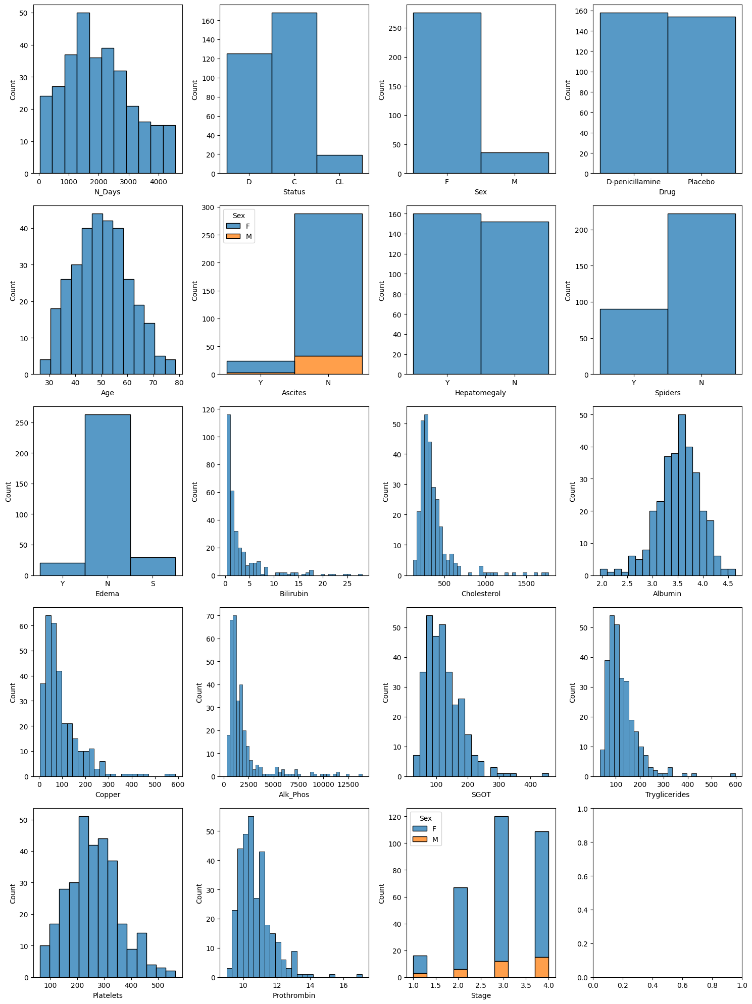
From the outputs of the predictors, we can see that some predictors are more normally distributed (such as age, albumin concentration, etc.) while others were more exponentially distributed (such as Biliribin concentrate, Copper concentrate, etc.). What this tells us is for the exponentially distributed predictors, we can see that for most (if not all patients) had a lower concentration of Expotentially distributed predictor X
Background: Understanding the PBC data
I am interested in using the Primary Bilary Cirrhosis dataset because medical statistics/public health is something that I'm very interested and passionate about. I even used this dataset for my thesis work. Because medical datasets are very difficult to get, and probably not appropriate to use machine learning on, I had to resort to using this.
In my thesis, I used survival analysis techniques on this dataset. This time, for the purpose of this project, I will use machine learning methods. So, we will ignore any survival analysis techniques and focus strictly on machine learning
The Questions that I have for this dataset are:
- Which predictor (covariate) has the greatest significance in determining the number of days till event.
- Which histolic stage of the disease do we see the best, and worst, time till event
- Is the drug D-Pencillamine really effective against a placebo (with comparison to males vs females)
- Did patients who already died survived for not that long
- At what age do we see a significant number of deaths
Digging deeper into the dataset, we see that Cirrhosis (a rare but fatal chronic liver disease) is a late stage of scarring of the liver caused by many forms of liver diseases and conditions, such as alcholism or hepatitis. This dataset represents a double blinded clinical trial conducted by Mayo Clinic during years 1974-1984, yielding a total of 424 patients (about 1/4 of them are missing)
This clinical trial is a 10 year study here 424 patients who met elgibility criteria were open for patient registration. Note that 1/4 of the population dropped out, leading to about 312 patients remaining to be analyzed for the complete data.
During the study, the patients received a randomized placebo-controlled trial of the drug D-penicillamine, their measurements are recorded and such, and followed up.
The predictors uised in this dataset are: The predictors used in this dataset are:
- ID: unique identifier
- N_Days: number of days between registration and the earlier of death, transplantation, or study analysis time in July 1986
- Status: status of the patient C (censored), CL (censored due to liver tx), or D (death)
- Drug: type of drug D-penicillamine or placebo
- Age: age in days
- Sex: M (male) or F (female)
- Ascites: presence of ascites N (No) or Y (Yes)
- Hepatomegaly: presence of hepatomegaly N (No) or Y (Yes)
- Spiders: presence of spiders N (No) or Y (Yes)
- Edema: presence of edema N (no edema and no diuretic therapy for edema), S (edema present without diuretics, or edema resolved by diuretics), or Y (edema despite diuretic therapy)
- Bilirubin: serum bilirubin in mg/dl
- Cholesterol: serum cholesterol in mg/dl
- Albumin: albumin in gm/dl
- Copper: urine copper in ug/day
- Alk_Phos: alkaline phosphatase in U/liter
- SGOT: SGOT in U/ml
- Triglycerides: triglicerides in mg/dl
- Platelets: platelets per cubic ml/1000
- Prothrombin: prothrombin time in seconds s
- Stage: histologic stage of disease (1, 2, 3, or 4)
Histolic State of Disease
Here, we are plotting the Histolic Stage of the disease against the # of days of survival. PBC has 4 stages:
- Portal inflammation with or without florid bile duct lesions
- Increase in size of periportal lesions with interface hepatitis
- Distortion of hepatic architecture with numerous fibrous septa cirrhosis
In simple words, #1-4 would represent stages and severity of the disease where 4 is cirrhosis which is the worst stage to be in, could even result in death.
In this graph, we can see that those who are at stage 4 has the lowest number of days of survival (About 1400-1500) while those who are at stage 1 had the greatest number of days of survival (around 2800 days or so). What this tells us is simple, the higher the stage is, the worst the disease develops. This will then lead to death eventually.
import seaborn as snsimport matplotlib.pyplot as pltsns.barplot(x = 'Stage',y = 'N_Days',data = pbc)plt.show()import scipy.stats as st# Calculating and displaying confidence interval for 'N_Days'n_days_mean = np.mean(pbc['N_Days'])n_days_sem = st.sem(pbc['N_Days'])n_days_ci = st.t.interval(0.95, len(pbc['N_Days']) - 1, loc=n_days_mean, scale=n_days_sem)print("Confidence interval for N_Days:", n_days_ci)# Calculating and displaying confidence interval for 'Stage'stage_mean = np.mean(pbc['Stage'])stage_sem = st.sem(pbc['Stage'])stage_ci = st.t.interval(0.95, len(pbc['Stage']) - 1, loc=stage_mean, scale=stage_sem)print("Confidence interval for Stage:", stage_ci)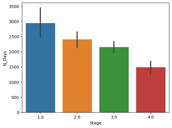
Confidence interval for Stage: (2.934260162001472, 3.129842402101092)
From this 95% CI , we observe that most of the patients fall into about the high stage 2 to low stage 3 of the histolic stage of the disease. This number suggest that most of these patients are at the disease stage that will place them at a high warning of cirrhosis.
Additionally, we observe that we are 95% confident that most patients will survive around 1890 to 2130 days
pbc.describe()| ID | N_Days | Age | Bilirubin | Cholesterol | Albumin | Copper | Alk_Phos | SGOT | Tryglicerides | Platelets | Prothrombin | Stage | |
|---|---|---|---|---|---|---|---|---|---|---|---|---|---|
| count | 312 | 312 | 312 | 312 | 284 | 312 | 310 | 312 | 312 | 282 | 308 | 312 | 312 |
| mean | 156.5 | 2006.36 | 50.05 | 3.26 | 369.51 | 3.52 | 97.65 | 1982.66 | 122.56 | 124.70 | 261.94 | 10.73 | 3.03 |
| std | 90.21 | 1123.28 | 10.59 | 4.53 | 231.94 | 0.42 | 85.61 | 2140.39 | 56.70 | 65.15 | 95.61 | 1.00 | 0.88 |
| min | 1 | 41 | 26.30 | 0.30 | 120 | 1.96 | 4 | 289 | 26.35 | 33 | 62 | 9 | 1 |
| 25% | 78.75 | 1191 | 42.27 | 0.80 | 249.50 | 3.31 | 41.25 | 871.50 | 80.60 | 84.25 | 199.75 | 10 | 2 |
| 50% | 156.5 | 1839.5 | 49.83 | 1.35 | 309.50 | 3.55 | 73 | 1259 | 114.70 | 108 | 257 | 10.60 | 3 |
| 75% | 234.25 | 2697.25 | 56.75 | 3.43 | 400 | 3.80 | 123 | 1980 | 151.90 | 151 | 322.50 | 11.10 | 4 |
| max | 312 | 4556 | 78.49 | 28 | 1775 | 4.64 | 588 | 13862.40 | 457.25 | 598 | 563 | 17.10 | 4 |
import pandas as pdimport matplotlib.pyplot as plt# Scatter plot with N_Days against Drugplt.scatter(pbc['Drug'], pbc['N_Days'], c=pbc['Age'], s=pbc['Stage'])# Adding Title to the Plotplt.title("Scatter Plot")# Setting the X and Y labelsplt.xlabel('Drug')plt.ylabel('Number of Days')plt.colorbar()plt.show()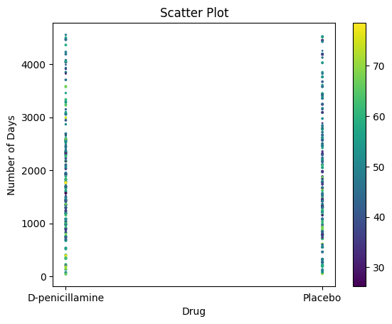
# Bar chart with day against tipplt.bar(pbc['Status'], pbc['N_Days'])plt.title("Bar Chart")# Setting the X and Y labelsplt.xlabel('Status')plt.ylabel('No. of days')# Adding the legendsplt.show()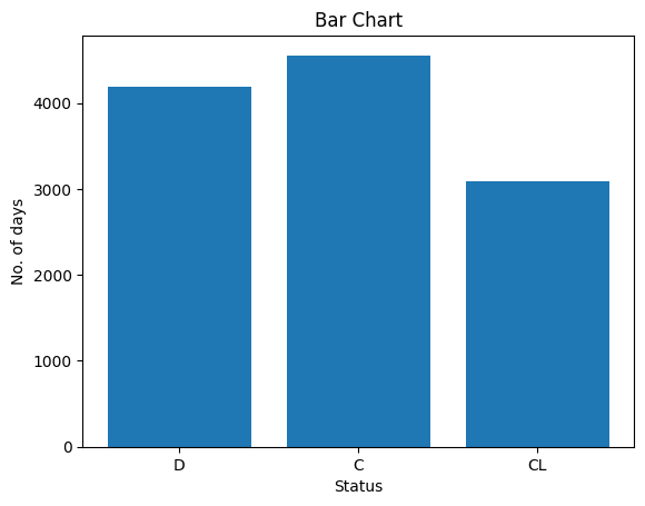
Scatterplots of Histolic Stage of Disease
# Set a larger figure sizefig, axs = plt.subplots(2, 3, figsize=(14, 10), gridspec_kw={'width_ratios': [1, 1, 1]}) # Adjust the size as neededx = pbc['N_Days']# Adjust subplot sizesaxs[0, 0].scatter(pbc['Drug'], x, s=20) # Increase scatter plot marker size if neededaxs[0, 0].set_title('Number of Days Vs Drug', fontsize=12) # Smaller title font sizeaxs[0, 1].scatter(x, pbc['Age'], s=20)axs[0, 1].set_title('Number of Days Vs Age', fontsize=12)axs[0, 2].scatter(x, pbc['Sex'], s=20)axs[0, 2].set_title('Number of Days Vs Sex', fontsize=12)axs[1, 0].scatter(x, pbc['Stage'], s=20)axs[1, 0].set_title('Number of Days Vs Stage', fontsize=12)axs[1, 1].scatter(x, pbc['SGOT'], s=20)axs[1, 1].set_title('Number of Days vs SGOT concentration', fontsize=12)axs[1, 2].scatter(x, pbc['Edema'], s=20)axs[1, 2].set_title('Number of Days vs Edema concentration', fontsize=12)# Improve spacing between subplotsplt.tight_layout()# Show the plotplt.show()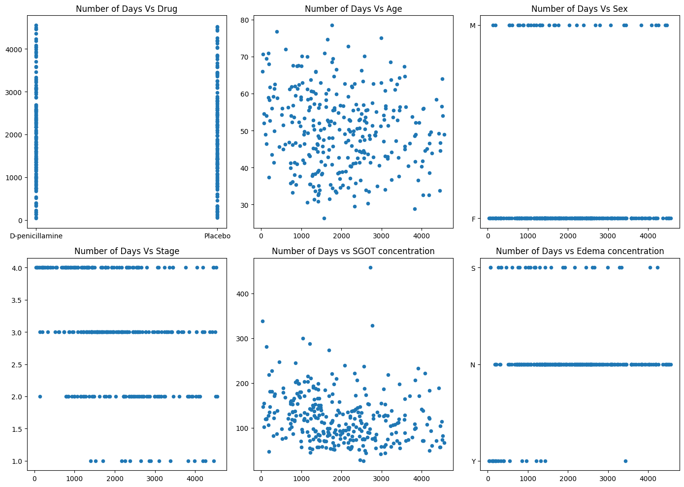
Scatterplot of Histolic Stage of diseasee against Number of days survival
From this graph, we observe that the distribution is more scattered as stage increases. To illustrate, at stage 1, we observe a minimal distribution of scattered individuals. As we progress in stage, the scatter distribution gets denser in the spread. For stage 4, we see a wide range of survival times; however, the distribution seems most dense at or before N_Days ⪅2000 Days. This tells us that if the patient is at stage 4 (cirrhosis), he/she will likely not survive past 2000 days; however, there are a few individuals that manage to survive longer.
import plotly.express as pxdf = pbcfig = px.scatter(df, x="N_Days", y="Stage", color="Stage", width=800, height=400)fig.show()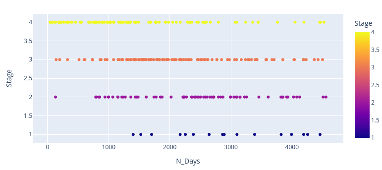
What age do we see the greatest number of deaths?
df = pbcfig2 = px.scatter(df, x="Status", y="Age", color="Age", width=800, height=400)fig2.show()pbc.deaths=pbc[pbc["Status"] == 'D']pbc.deaths.head()pbc.deaths.groupby("Sex")["N_Days"].describe()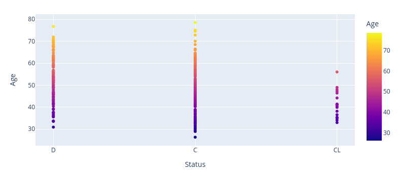
| Sex | Count | Mean | Std Dev | Min | 25% | 50% | 75% | Max |
|---|---|---|---|---|---|---|---|---|
| F | 103 | 1452.83 | 1074.33 | 41 | 635.0 | 1191.0 | 2240.0 | 3853.0 |
| M | 22 | 1582.41 | 1171.84 | 140 | 821.75 | 1184.5 | 2210.0 | 4191.0 |
pbc.not_dead=pbc[(pbc['Status'] == 'C') | (pbc['Status'] == 'CL')]pbc.not_dead.head()pbc.not_dead.groupby("Sex")["N_Days"].describe()| Sex | Count | Mean | Std Dev | Min | 25% | 50% | 75% | Max |
|---|---|---|---|---|---|---|---|---|
| F | 173 | 2348.76 | 970.48 | 732 | 1558.0 | 2241.0 | 2944.0 | 4556.0 |
| M | 14 | 2513.93 | 1371.34 | 533 | 1410.75 | 2128.5 | 3726.25 | 4459.0 |
pbc_stacked_bar = pbc.loc[pbc['N_Days'].isin([*range(0, 100000)]), ['Drug', 'N_Days']].copy()pbc.dropna(inplace=True)pbc_stacked_bar['N_Days'] = pbc_stacked_bar['N_Days'].astype('int')pbc_stacked_bar| Drug | N_Days | |
|---|---|---|
| 0 | D-penicillamine | 400 |
| 1 | D-penicillamine | 4500 |
| 2 | D-penicillamine | 1012 |
| 3 | D-penicillamine | 1925 |
| 4 | Placebo | 1504 |
| ... | ... | ... |
| 307 | D-penicillamine | 1153 |
| 308 | Placebo | 994 |
| 309 | D-penicillamine | 939 |
| 310 | D-penicillamine | 839 |
| 311 | Placebo | 788 |
# Filter the datapbc_filtered = pbc.loc[pbc['N_Days'].isin(range(0, 10000)), ['Drug', 'N_Days', 'Sex']].copy()pbc_filtered.dropna(inplace=True)pbc_filtered['N_Days'] = pbc_filtered['N_Days'].astype('int')# Create a stacked bar chartplt.figure(figsize=(10, 6))sns.barplot(x='Sex', y='N_Days', hue='Drug', data=pbc_filtered, estimator=sum, ci=None)plt.title('Stacked Bar Chart of #Days by Drug and Sex')plt.ylabel('#Days')plt.xlabel('Sex')plt.legend(title='Drug')plt.show()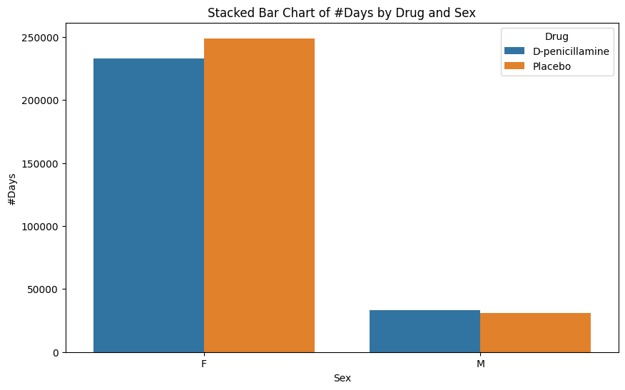
From this chart above, we observe that Females had a similar survival time (regardless of drug). Males, on the other hand, had similar survival times, but signficantly less than those of females.
pbc_stacked_barcross_tab_prop = pd.crosstab(index=pbc_stacked_bar['N_Days'], columns=pbc_stacked_bar['Drug'], normalize="index")cross_tab_prop| N_Days | Drug | Placebo |
|---|---|---|
| 41 | 1.0 | 0.0 |
| 51 | 0.0 | 1.0 |
| 71 | 1.0 | 0.0 |
| 77 | 0.0 | 1.0 |
| 110 | 0.0 | 1.0 |
| ... | ... | ... |
| 4467 | 1.0 | 0.0 |
| 4500 | 1.0 | 0.0 |
| 4509 | 0.0 | 1.0 |
| 4523 | 0.0 | 1.0 |
| 4556 | 1.0 | 0.0 |
pbc_stacked_barcross_tab_prop = pd.crosstab(index=pbc_stacked_bar['N_Days'], columns=pbc_stacked_bar['Drug'], normalize="index")cross_tab_prop| N_Days | D-penicillamine | Placebo |
|---|---|---|
| 41 | 1.0 | 0.0 |
| 51 | 0.0 | 1.0 |
| 71 | 1.0 | 0.0 |
| 77 | 0.0 | 1.0 |
| 110 | 0.0 | 1.0 |
| ... | ... | ... |
| 4467 | 1.0 | 0.0 |
| 4500 | 1.0 | 0.0 |
| 4509 | 0.0 | 1.0 |
| 4523 | 0.0 | 1.0 |
| 4556 | 1.0 | 0.0 |
pbc.head()| ID | N_Days | Status | Drug | Age | Sex | Ascites | Hepatomegaly | Spiders | Edema | Bilirubin | Cholesterol | Albumin | Copper | Alk_Phos | SGOT | Tryglicerides | Platelets | Prothrombin | Stage |
|---|---|---|---|---|---|---|---|---|---|---|---|---|---|---|---|---|---|---|---|
| 1 | 400 | D | D-penicillamine | 58.805479 | F | Y | Y | Y | Y | 14.5 | 261.0 | 2.60 | 156.0 | 1718.0 | 137.95 | 172.0 | 190.0 | 12.2 | 4.0 |
| 2 | 4500 | C | D-penicillamine | 56.484932 | F | N | Y | Y | N | 1.1 | 302.0 | 4.14 | 54.0 | 7394.8 | 113.52 | 88.0 | 221.0 | 10.6 | 3.0 |
| 3 | 1012 | D | D-penicillamine | 70.120548 | M | N | N | N | S | 1.4 | 176.0 | 3.48 | 210.0 | 516.0 | 96.10 | 55.0 | 151.0 | 12.0 | 4.0 |
| 4 | 1925 | D | D-penicillamine | 54.778082 | F | N | Y | Y | S | 1.8 | 244.0 | 2.54 | 64.0 | 6121.8 | 60.63 | 92.0 | 183.0 | 10.3 | 4.0 |
| 5 | 1504 | CL | Placebo | 38.131507 | F | N | Y | Y | N | 3.4 | 279.0 | 3.53 | 143.0 | 671.0 | 113.15 | 72.0 | 136.0 | 10.9 | 3.0 |
Splitting data into testing and training sets as well as Linear Regression
#We will ad a 0-1 Column. IF Patient Status = C or Cl we set it as 1 (indicating that this person may have survived). Othersize, if status=D, then 0#pbc=pd.DataFrame(pbc,columns=['Classify'])pbc["Classify"] = pd.Series(dtype='int')pbc['Classify'] = [1 if x == "C" else 0 if x == "CL" else 0 for x in pbc['Status']]pbc.head()#Removing non-numeric columnspbc_classification = pbc.drop(['ID','Status','Drug', 'Sex', 'Ascites','Hepatomegaly', 'Spiders', 'Edema'], axis=1)pbc_classification.head()features=['Age','Bilirubin','Cholesterol','Albumin','Copper','Alk_Phos','SGOT', 'Tryglicerides','Platelets','Prothrombin','Stage','N_Days']df=pbc_classification.loc[:,features]df.head()X=df.loc[:,features]features = [col for col in features if col != 'N_Days']X = df.loc[:, features]y=pbc_classification['N_Days']y
0       400
1      4500
2      1012
3      1925
4      1504
       ...
307    1153
308     994
309     939
310     839
311     788
Name: N_Days, Length: 276, dtype: int64
#Split the dataset into train and testingfrom sklearn.model_selection import train_test_splitX_train, X_test, y_train, y_test=train_test_split(X,y,test_size=0.2, random_state=234343)from sklearn.linear_model import LinearRegressionregressor=LinearRegression()regressor.fit(X_train,y_train)y_pred=regressor.predict(X_test)y_predfor x, y in zip(y_pred, y_test): print(f'X: {y_pred}, Y: {y_test}')X: [ 2.13769272e+03 1.99250755e+03 2.25744462e+03 2.34826804e+03
2.25271102e+03 2.20719117e+03 1.33229075e+03 1.96324286e+03
2.30601830e+03 1.96741456e+03 1.99136967e+03 2.31464539e+03
2.92600882e+03 1.75823122e+03 2.28878875e+03 1.25424205e+03
2.11135213e+03 2.82981200e+03 2.23500234e+03 1.69906496e+03
1.55810744e+03 1.11313759e+03 1.97157713e+03 2.26430217e+03
2.15310137e+03 2.07394356e+03 1.92026302e+03 1.27965151e+03
2.80101270e+03 2.58927999e+03 2.11228218e+03 1.69714107e+03
1.66376290e+03 2.12796110e+03 1.98901970e+03 1.85010780e+03
2.15591848e+03 2.91427610e+03 9.87831952e+02 3.14179751e+03
2.18530841e+03 2.79496972e+03 2.00797695e+03 -2.63339670e+00
2.29439171e+03 2.83205654e+03 2.29728096e+03 3.00158074e+03
2.92842374e+03 1.98838960e+03 2.80688414e+03 1.48204968e+03
2.18770945e+03 1.16393638e+03 1.44216847e+03 1.70673634e+03], Y: 209 2224
169 2692
257 1702
279 1412
130 850
157 2475
61 3090
243 1690
45 2256
197 2357
25 1444
131 2944
28 4509
36 223
156 2835
286 1234
239 1831
104 3092
134 3150
59 4365
161 186
216 790
247 1785
233 1776
268 1363
20 3445
227 1967
264 1084
256 1614
218 2157
184 2527
296 533
158 1536
311 788
...
#Measuring train test split model performancescore = regressor.score(X_test, y_test)print(score)0.19141480106865782
From using the ML linear regression model, we observe that splitting it into testing and training was not appropriate. The accuracy is 19% (meaning very poor). Aditionally, you can see by the graph below is not too accurate either. Therefore, we will use the standard linear regression model that doesn't involve train-test-split
plt.figure(figsize=(8,8))plt.scatter(y_test, y_pred, c='crimson')plt.yscale('log')plt.xscale('log')p1 = max(max(y_pred), max(y_test))p2 = min(min(y_pred), min(y_test))plt.plot([p1, p2], [p1, p2], 'b-')plt.xlabel('True Values', fontsize=15)plt.ylabel('Predictions', fontsize=15)plt.axis('equal')plt.show()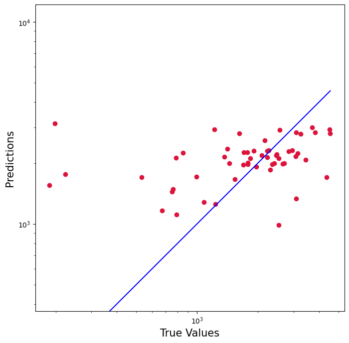
The baseline statistical model used for predicting a numerical response with one or more quantitative and/or qualitative explanatory variables is the multiple linear regression model, which takes the form
y_i = \beta_0 + \beta_1 xi1 + \beta xi2 + \ldots + \beta (p-1) x (ip - 1) + \epsilon i
where the β 's are unknown parameters that characterize the relationship between The number of days till survival event. and the ϵ represents the unknown difference between the observed value of the response, and the mathematical model with unknown parameters.
#Using a non machine learning linear regression modelimport statsmodels.api as smx1 = df[['Age','Bilirubin','Cholesterol','Albumin','Copper','Alk_Phos','SGOT', 'Tryglicerides','Platelets','Prothrombin','Stage']]y1 = df['N_Days']x1 = sm.add_constant(x1)model = sm.OLS(y1, x1).fit()predictions = model.predict(x1)print_model = model.summary()print(print_model) OLS Regression Results
==============================================================================
Dep. Variable: N_Days R-squared: 0.367
Model: OLS Adj. R-squared: 0.341
Method: Least Squares F-statistic: 13.93
Date: Fri, 22 Dec 2023 Prob (F-statistic): 4.93e-21
Time: 04:03:58 Log-Likelihood: -2263.9
No. Observations: 276 AIC: 4552.
Df Residuals: 264 BIC: 4595.
Df Model: 11
Covariance Type: nonrobust
=================================================================================
coef std err t P>|t| [0.025 0.975]
---------------------------------------------------------------------------------
const -439.6192 980.277 -0.448 0.654 -2369.775 1490.536
Age -3.2399 5.621 -0.576 0.565 -14.307 7.827
Bilirubin -69.9201 17.025 -4.107 0.000 -103.442 -36.398
Cholesterol -0.1878 0.276 -0.681 0.496 -0.730 0.355
Albumin 672.8911 152.025 4.426 0.000 373.555 972.228
Copper -2.3132 0.731 -3.166 0.002 -3.752 -0.874
Alk_Phos 0.1015 0.027 3.733 0.000 0.048 0.155
SGOT 0.6957 1.135 0.613 0.540 -1.539 2.930
Tryglicerides 0.5632 0.971 0.580 0.562 -1.348 2.474
Platelets 0.2708 0.639 0.424 0.672 -0.987 1.529
Prothrombin 98.8891 61.212 1.616 0.107 -21.636 219.415
Stage -244.1777 70.919 -3.443 0.001 -383.817 -104.539
==============================================================================
Omnibus: 1.952 Durbin-Watson: 1.536
Prob(Omnibus): 0.377 Jarque-Bera (JB): 2.015
Skew: 0.198 Prob(JB): 0.365
Kurtosis: 2.863 Cond. No. 5.32e+04
==============================================================================
Notes:
[1] Standard Errors assume that the covariance matrix of the errors is correctly specified.
[2] The condition number is large, 5.32e+04. This might indicate that there are
strong multicollinearity or other numerical problems.
Equation for line of best fit is
We do observe that there are covariates that are insignificant (having high
p-values). Also, note that
#Reducing the model to its significant covariates
x1_reduced = df[['Bilirubin','Albumin','Copper','Alk_Phos',
          'Stage']]
x1_reduced = sm.add_constant(x1_reduced)


model = sm.OLS(y1, x1_reduced).fit()
predictions = model.predict(x1_reduced)

print_model = model.summary()
print(print_model)
                            OLS Regression Results
==============================================================================
Dep. Variable:                 N_Days   R-squared:                       0.359
Model:                            OLS   Adj. R-squared:                  0.347
Method:                 Least Squares   F-statistic:                     30.21
Date:                Fri, 22 Dec 2023   Prob (F-statistic):           2.35e-24
Time:                        04:04:01   Log-Likelihood:                -2265.8
No. Observations:                 276   AIC:                             4544.
Df Residuals:                     270   BIC:                             4565.
Df Model:                           5
Covariance Type:            nonrobust
==============================================================================
                 coef    std err          t      P>|t|      [0.025      0.975]
------------------------------------------------------------------------------
const        507.0760    618.035      0.820      0.413    -709.705    1723.857
Bilirubin    -62.3500     13.716     -4.546      0.000     -89.354     -35.346
Albumin      679.8153    146.430      4.643      0.000     391.526     968.105
Copper        -2.1679      0.715     -3.034      0.003      -3.575      -0.761
Alk_Phos       0.1071      0.026      4.080      0.000       0.055       0.159
Stage       -232.3123     68.882     -3.373      0.001    -367.926     -96.698
==============================================================================
Omnibus:                        3.751   Durbin-Watson:                   1.452
Prob(Omnibus):                  0.153   Jarque-Bera (JB):                3.821
Skew:                           0.266   Prob(JB):                        0.148
Kurtosis:                       2.780   Cond. No.                     3.41e+04
==============================================================================

Notes:
[1] Standard Errors assume that the covariance matrix of the errors is correctly specified.
[2] The condition number is large, 3.41e+04. This might indicate that there are
strong multicollinearity or other numerical problems.
Equation for reduced line of best fit is
By dropping the insignficant covariates of our previous model, we now have a
reduced model with
#Lets try classification, BinaryX_class=pbc_classification.iloc[:, :-1]y_class=pbc_classification.iloc[:, -1]pbc_classification['Classify'].value_counts() #There are 147 1's and 129 0's. So we have a binary classification problem1 147
0 129
Name: Classify, dtype: int64
What is a Confusion Matrix?
Before we jump into applying the model(s) to our test and train dataset. We have to know what a confusion matrix is. A confusion matrix is part of a binary classifier where we are predicting 2 things, hence a binary response. (Ex: 0-1 response, positive or negative, dead or alive, etc.)
When evaluating such binary classifiers, in our case a 0-1 response where 0 represents death and 1 represents censoring (possibly alive, but unsure), the possible outcomes are dead or alive.
Thus,
- If the model successfully predicts the patients are alive/censored, this is a True Positive (TP)
- If the model successfully predicts the patients are dead, this is a True Negative (TN)
*Note that the binary classification model may mispredict some patients, therefore:
- If a dead patient is classified as alive, this is a False Positive (FP)
- If a alive patient is classified as dead, this is a False Negative (FN)
Once the values are obtained, the accuracy score of this binary classifier is:
The higher the accuracy, the better our model is
K_nearest Neighbor (KNN)
The K_nearest neighbor algorithm is a regression or classification algorithm, but more towards the classification side. This is a non-parametric supervised learning classifier, which uses proximity to make classifications or predictions about the grouping of an individual datapoint.
import matplotlib.pyplot as pltfrom sklearn.model_selection import train_test_splitX_class_train, X_class_test, y_class_train, y_class_test = train_test_split(X_class, y_class , test_size=0.2, random_state=34524)#Normalizing data to prevent leakage, this will also fit the logistic model to the training datafrom sklearn.preprocessing import StandardScalerss_train = StandardScaler()X_class_train = ss_train.fit_transform(X_class_train)ss_test = StandardScaler()X_class_test = ss_test.fit_transform(X_class_test)from sklearn.neighbors import KNeighborsClassifierKNN=KNeighborsClassifier()KNN.fit(X_class_train, y_class_train)predictions = KNN.predict(X_class_test)predictionsarray([0, 0, 1, 1, 1, 0, 1, 1, 0, 1, 1, 1, 1, 1, 0, 0, 1, 0, 0, 1, 1, 0,
1, 1, 0, 0, 0, 1, 0, 1, 1, 1, 1, 1, 1, 1, 0, 0, 1, 1, 0, 0, 1, 1,
1, 1, 1, 1, 1, 0, 1, 0, 1, 0, 0, 0])
X_class
| N_Days | Age | Bilirubin | Cholesterol | Albumin | Copper | Alk_Phos | SGOT | Tryglicerides | Platelets | Prothrombin | Stage |
|---|---|---|---|---|---|---|---|---|---|---|---|
| 400 | 58.805479 | 14.5 | 261.0 | 2.60 | 156.0 | 1718.0 | 137.95 | 172.0 | 190.0 | 12.2 | 4.0 |
| 4500 | 56.484932 | 1.1 | 302.0 | 4.14 | 54.0 | 7394.8 | 113.52 | 88.0 | 221.0 | 10.6 | 3.0 |
| 1012 | 70.120548 | 1.4 | 176.0 | 3.48 | 210.0 | 516.0 | 96.10 | 55.0 | 151.0 | 12.0 | 4.0 |
| 1925 | 54.778082 | 1.8 | 244.0 | 2.54 | 64.0 | 6121.8 | 60.63 | 92.0 | 183.0 | 10.3 | 4.0 |
| 1504 | 38.131507 | 3.4 | 279.0 | 3.53 | 143.0 | 671.0 | 113.15 | 72.0 | 136.0 | 10.9 | 3.0 |
| ... | ... | ... | ... | ... | ... | ... | ... | ... | ... | ... | ... |
| 1153 | 61.224658 | 0.4 | 246.0 | 3.58 | 24.0 | 797.0 | 91.00 | 113.0 | 288.0 | 10.4 | 2.0 |
| 994 | 58.339726 | 0.4 | 260.0 | 2.75 | 41.0 | 1166.0 | 70.00 | 82.0 | 231.0 | 10.8 | 2.0 |
| 939 | 62.375342 | 1.7 | 434.0 | 3.35 | 39.0 | 1713.0 | 171.00 | 100.0 | 234.0 | 10.2 | 2.0 |
| 839 | 38.024658 | 2.0 | 247.0 | 3.16 | 69.0 | 1050.0 | 117.00 | 88.0 | 335.0 | 10.5 | 2.0 |
| 788 | 33.175342 | 6.4 | 576.0 | 3.79 | 186.0 | 2115.0 | 136.00 | 149.0 | 200.0 | 10.8 | 2.0 |
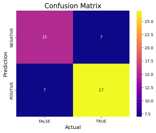
from sklearn.metrics import confusion_matrixfrom sklearn.metrics import accuracy_score, precision_score, recall_score, f1_score# Assuming predictions contain probabilities, use a threshold (e.g., 0.5) to convert to classesthreshold = 0.5 # Adjust the threshold if neededpredictions_binary = (predictions > threshold).astype(int)cm_binary = confusion_matrix(y_class_test, predictions_binary)TN, FP, FN, TP = confusion_matrix(y_class_test, predictions_binary).ravel()print('True Positive(TP) = ', TP)print('False Positive(FP) = ', FP)print('True Negative(TN) = ', TN)print('False Negative(FN) = ', FN)accuracy = (TP + TN) / (TP + FP + TN + FN)print('Accuracy of the binary classifier = {:0.3f}'.format(accuracy))#Plot the confusion matrix.sns.heatmap(cm_binary, annot=True, fmt='g', xticklabels=['FALSE','TRUE'], yticklabels=['NEGATIVE','POSITIVE'],cmap='plasma')plt.ylabel('Prediction',fontsize=13)plt.xlabel('Actual',fontsize=13)plt.title('Confusion Matrix',fontsize=17)plt.show()# Finding precision and recallaccuracy = accuracy_score(y_class_test, predictions_binary)print("Accuracy :", accuracy)precision = precision_score(y_class_test, predictions_binary)print("Precision :", precision)recall = recall_score(y_class_test, predictions_binary)print("Recall :", recall)F1_score = f1_score(y_class_test, predictions_binary)print("F1-score :", F1_score)True Positive(TP) = 27
False Positive(FP) = 7
True Negative(TN) = 15
False Negative(FN) = 7
Accuracy of the binary classifier = 0.750
Accuracy   : 0.75
Precision : 0.7941176470588235
Recall    : 0.7941176470588235
F1-score  : 0.7941176470588235
Logistic Regression
Logistic regression is a statistical approach and also a ML algorithm that can also be used for classification problems and is based on the concept of probability. It is used when the dependent variable is either categorical or falls into a 0-1 response.
In the case of this problem, our response is binary and we are trying to predict whether the person is maybe alive (response=1, indicating censoring) or dead (response=0, indicating death)
#Trying logistic regressionfrom sklearn.linear_model import LogisticRegressionlogis_dataset=pbc_classificationlogis_dataset.head()X=logis_dataset.drop('Classify',axis=1)y=logis_dataset['Classify']# Split the data into training and testing setsX_train, X_test, y_train, y_test = train_test_split(X, y, test_size=0.2, random_state=322323)# Train a logistic regression model on the training datamodel = LogisticRegression()model.fit(X_train, y_train)# Predict the test data using the trained modely_pred = model.predict(X_test)# Calculate the confusion matrix of predicted vs actual valuescm_logistic = confusion_matrix(y_test, y_pred)print("Confusion Matrix:")print(cm_logistic)#Plot the confusion matrix.sns.heatmap(cm_logistic, annot=True, fmt='g', xticklabels=['FALSE','TRUE'], yticklabels=['NEGATIVE','POSITIVE'])plt.ylabel('Prediction',fontsize=6)plt.xlabel('Actual',fontsize=6)plt.title('Confusion Matrix',fontsize=6)plt.show()TN, FP, FN, TP = confusion_matrix(y_test, y_pred).ravel()print('True Positive(TP) = ', TP)print('False Positive(FP) = ', FP)print('True Negative(TN) = ', TN)print('False Negative(FN) = ', FN)accuracy = (TP + TN) / (TP + FP + TN + FN)print('Accuracy of the binary classifier = {:0.3f}'.format(accuracy))# Finding precision and recallaccuracy = accuracy_score(y_test, y_pred)print("Accuracy :", accuracy)precision = precision_score(y_test, y_pred)print("Precision :", precision)recall = recall_score(y_test, y_pred)print("Recall :", recall)F1_score = f1_score(y_test, y_pred)print("F1-score :", F1_score)Confusion Matrix:
[[14 10]
[ 6 26]]
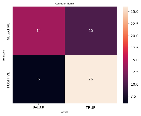
True Positive(TP)  =  26
False Positive(FP) =  10
True Negative(TN)  =  14
False Negative(FN) =  6
Accuracy of the binary classifier = 0.714
Accuracy   : 0.7142857142857143
Precision : 0.7222222222222222
Recall    : 0.8125
F1-score  : 0.7647058823529411
To determine if this logistic classification model is good or bad, we analyze the important metrics of the confusion matrix
- Accuracy
- Precision
- Recall
- F1 Score
The accuracy of about 71% suggests to us that the model was kind of accurate in the fact that it predicted the classes of around 71% of the testing set. Despite not being high, this accuracy may be acceptable for this setting.
The precision and recall is about 72% and 81%, meaning that out of the insttances predicted as positive, 72% were actually positive, so the model captured 72% of all actual positive instances.
Decision Trees
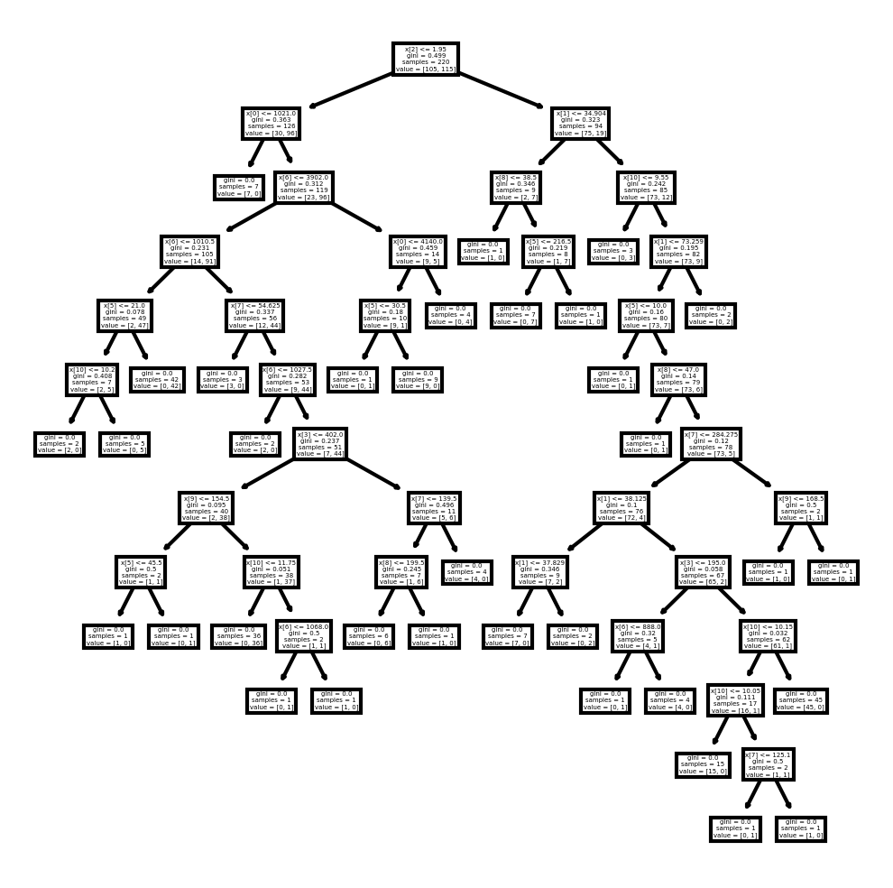
A decision tree is a non-parametric supervised machine algorithm. This can be used for either regression or classification tasks. It creates a hierarchical tree structure which consists of a root node, branches, internal nodes and leaf nodes. They start with nodes that can branch out based on categories.
#Try decision treesfrom sklearn.tree import DecisionTreeClassifierfrom sklearn import metricsfrom sklearn import treefrom sklearn.tree import DecisionTreeRegressorX_train, X_test, y_train, y_test = train_test_split(X, y, test_size=0.2, random_state=322323)#Creating a decision tree classifierDTC=DecisionTreeClassifier()#Training the classifierDTC=DTC.fit(X_train,y_train)#Predict the response for testing datasety_pred=DTC.predict(X_test)#Model evaluationprint("Accuracy:",metrics.accuracy_score(y_test, y_pred))Accuracy: 0.75
# Calculate the confusion matrix of predicted vs actual valuescm_dt = confusion_matrix(y_test, y_pred)print("Confusion Matrix:")print(cm_dt)#Plot the confusion matrix.sns.heatmap(cm_dt, annot=True, fmt='g', xticklabels=['FALSE','TRUE'], yticklabels=['NEGATIVE','POSITIVE'], cmap='Blues')plt.ylabel('Prediction',fontsize=13)plt.xlabel('Actual',fontsize=13)plt.title('Confusion Matrix',fontsize=17)plt.show()TN, FP, FN, TP = confusion_matrix(y_test, y_pred).ravel()print('True Positive(TP) = ', TP)print('False Positive(FP) = ', FP)print('True Negative(TN) = ', TN)print('False Negative(FN) = ', FN)accuracy = (TP + TN) / (TP + FP + TN + FN)print('Accuracy of the binary classifier = {:0.3f}'.format(accuracy))# Finding precision and recallaccuracy = accuracy_score(y_test, y_pred)print("Accuracy :", accuracy)precision = precision_score(y_test, y_pred)print("Precision :", precision)recall = recall_score(y_test, y_pred)print("Recall :", recall)F1_score = f1_score(y_test, y_pred)print("F1-score :", F1_score)Confusion Matrix:
[[20 4]
[10 22]]
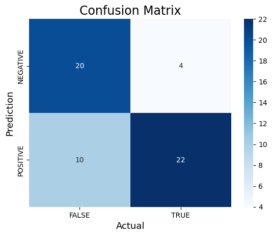
True Positive(TP)  =  22
False Positive(FP) =  4
True Negative(TN)  =  20
False Negative(FN) =  10
Accuracy of the binary classifier = 0.750
Accuracy   : 0.75
Precision : 0.8461538461538461
Recall    : 0.6875
F1-score  : 0.7586206896551724
#Plotting the treefig, axes = plt.subplots(nrows = 1, ncols = 1, figsize = (4,4), dpi = 300)tree.plot_tree(DTC)[Text(0.47572815533980584, 0.9615384615384616, 'x[2] <= 1.95\ngini = 0.499\nsamples = 220\nvalue = [105, 115]'),
Text(0.2912621359223301, 0.8846153846153846, 'x[0] <= 1021.0\ngini = 0.363\nsamples = 126\nvalue = [30, 96]'),
Text(0.2524271844660194, 0.8076923076923077, 'gini = 0.0\nsamples = 7\nvalue = [7, 0]'),
Text(0.3300970873786408, 0.8076923076923077, 'x[6] <= 3902.0\ngini = 0.312\nsamples = 119\nvalue = [23, 96]'),
Text(0.1941747572815534, 0.7307692307692307, 'x[6] <= 1010.5\ngini = 0.231\nsamples = 105\nvalue = [14, 91]'),
Text(0.11650485436893204, 0.6538461538461539, 'x[5] <= 21.0\ngini = 0.078\nsamples = 49\nvalue = [2, 47]'),
Text(0.07766990291262135, 0.5769230769230769, 'x[10] <= 10.2\ngini = 0.408\nsamples = 7\nvalue = [2, 5]'),
Text(0.038834951456310676, 0.5, 'gini = 0.0\nsamples = 2\nvalue = [2, 0]'),
Text(0.11650485436893204, 0.5, 'gini = 0.0\nsamples = 5\nvalue = [0, 5]'),
Text(0.1553398058252427, 0.5769230769230769, 'gini = 0.0\nsamples = 42\nvalue = [0, 42]'),
Text(0.27184466019417475, 0.6538461538461539, 'x[7] <= 54.625\ngini = 0.337\nsamples = 56\nvalue = [12, 44]'),
...
Text(0.9223300970873787, 0.19230769230769232, 'gini = 0.0\nsamples = 45\nvalue = [45, 0]'),
Text(0.9223300970873787, 0.4230769230769231, 'x[9] <= 168.5\ngini = 0.5\nsamples = 2\nvalue = [1, 1]'),
Text(0.883495145631068, 0.34615384615384615, 'gini = 0.0\nsamples = 1\nvalue = [1, 0]'),
Text(0.9611650485436893, 0.34615384615384615, 'gini = 0.0\nsamples = 1\nvalue = [0, 1]'),
Text(0.8155339805825242, 0.6538461538461539, 'gini = 0.0\nsamples = 2\nvalue = [0, 2]')]
#Trying the Support Vector Machine (SVM) Model#Import svm modelfrom sklearn import svm#Create a svm ClassifierSVM = svm.SVC(kernel='linear') # Linear Kernel#Train the model using the training setsSVM.fit(X_class_train, y_class_train)#Predict the response for test datasety_SVM_pred = SVM.predict(X_class_test)y_SVM_predarray([1, 0, 0, 0, 1, 0, 1, 0, 0, 0, 1, 1, 1, 1, 0, 0, 1, 1, 0, 1, 0, 0,
1, 0, 0, 0, 0, 1, 0, 1, 1, 1, 1, 1, 1, 0, 0, 0, 1, 0, 1, 1, 0, 1,
1, 1, 0, 1, 0, 0, 1, 0, 1, 0, 1, 0])
#Import scikit-learn metrics module for accuracy calculationfrom sklearn import metrics# Model Accuracy: how often is the classifier correct?print("Accuracy:",metrics.accuracy_score(y_test, y_SVM_pred)) #Poor accuracyAccuracy: 0.5357142857142857
Random Forest
Similar to decision trees, random forests generates a random subset of variables (features) which ensures low correlation among decision trees as well as prevent overfitting. One key feature of this algorithm is that it can handle datasets containing continous variables(regression) and categorical variables (classification).
It does perform better for regression and classification tasks. The key difference between decision trees and random forests is that decision trees consider all the possible variable splits, but random forests only selects a subset of these variables. A benefit of using a random forest model is its feature importance where it is easy to measure the relative importance of each feature on the prediction. From the output below, we can see which predictors are important in determining the prediction outcome.
| RandomForestClassifier |
|---|
| RandomForestClassifier(max_features='auto', n_estimators=50, random_state=33333) |
rf_prediction=rf_model.predict(X_rf_test)rf_prediction#rf_model.classes_ #This code is to determining what we are prediction, in this case 0 or 1rf_model.feature_importances_ #This code reflects the order of the columns in the features dfarray([0.13529009, 0.06565965, 0.17996739, 0.06003877, 0.06596153,
0.13009383, 0.06539225, 0.07184374, 0.05218709, 0.04183906,
0.1055137 , 0.0262129 ])
Displaying Variable Importances
This code basically reflects the order of the columns in the classificaiton dataset.
From the output, we see that Bilirubin has the highest predicing power (approx 17.99%) in the 0-1 response
#Display variable importancesvar_names=pd.DataFrame(['N_Days','Age','Bilirubin','Cholesterol','Albumin','Copper','Alk_Phos','SGOT', 'Tryglicerides','Platelets','Prothrombin','Stage'], columns=['var_name'])loss_reduction=pd.DataFrame(rf_model.feature_importances_,columns=['loss_reduction'])var_importance=pd.concat([var_names,loss_reduction],axis=1)var_importance=var_importance.sort_values("loss_reduction",axis=0, ascending=False)print(var_importance) var_name loss_reduction
2 Bilirubin 0.179967
0 N_Days 0.135290
5 Copper 0.130094
10 Prothrombin 0.105514
7 SGOT 0.071844
4 Albumin 0.065962
1 Age 0.065660
6 Alk_Phos 0.065392
3 Cholesterol 0.060039
8 Tryglicerides 0.052187
9 Platelets 0.041839
11 Stage 0.026213
Variable_name=['Bilirubin','N_Days','Copper', 'Prothrombin', 'SGOT', 'Albumin', 'Age', 'Alk_phos', 'Cholesterol', 'Tryglicerides', 'Platelets', 'Stage']data=[0.179967,0.135290,0.130094,0.105514,0.071844,0.065962,0.065660,0.065392,0.060039,0.052187,0.041839,0.0265213]df=pd.DataFrame({'Time':Variable_name,'Data':data})plt.bar(df['Time'],df['Data'],width=0.8)plt.xticks(rotation=90)plt.title('Variable importance graph')plt.xlabel('Predictors')plt.ylabel('Importance')#Show graphplt.show()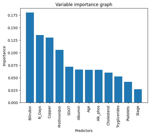
#View accuracy scoreaccuracy_score(y_rf_test,rf_prediction) #The accuracy score is 75% on test data. It's ok given the circumstance of the dataset but not that imporessive0.75
# View confusion matrix for test data and predictionscm_rf=confusion_matrix(y_rf_test, rf_prediction)cm_rfarray([[13, 12],
[ 2, 29]])
print("Confusion Matrix:")print(cm_rf)#Plot the confusion matrix.sns.heatmap(cm_rf, annot=True, fmt='g', xticklabels=['FALSE','TRUE'], yticklabels=['NEGATIVE','POSITIVE'],cmap='coolwarm')plt.ylabel('Prediction',fontsize=13)plt.xlabel('Actual',fontsize=13)plt.title('Confusion Matrix',fontsize=17)plt.show()TN, FP, FN, TP = confusion_matrix(y_rf_test, rf_prediction).ravel()print('True Positive(TP) = ', TP)print('False Positive(FP) = ', FP)print('True Negative(TN) = ', TN)print('False Negative(FN) = ', FN)accuracy = (TP + TN) / (TP + FP + TN + FN)print('Accuracy of the binary classifier = {:0.3f}'.format(accuracy))# Finding precision and recallaccuracy = accuracy_score(y_rf_test, rf_prediction)print("Accuracy :", accuracy)precision = precision_score(y_rf_test, rf_prediction)print("Precision :", precision)recall = recall_score(y_rf_test, rf_prediction)print("Recall :", recall)F1_score = f1_score(y_rf_test, rf_prediction)print("F1-score :", F1_score)Confusion Matrix:
[[13 12]
[ 2 29]]
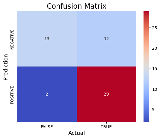
True Positive(TP)  =  29
False Positive(FP) =  12
True Negative(TN)  =  13
False Negative(FN) =  2
Accuracy of the binary classifier = 0.750
Accuracy   : 0.75
Precision : 0.7073170731707317
Recall    : 0.9354838709677419
F1-score  : 0.8055555555555556
accuracy = accuracy_score(y_class_test, predictions_binary)print("KNN-Accuracy:",accuracy_score(y_class_test, predictions_binary))accuracy = accuracy_score(y_test, y_pred)print("Logistic regression Accuracy:",accuracy_score(y_test, y_pred))print("Decision Tree Accuracy:",metrics.accuracy_score(y_test, y_pred))print("SVM Accuracy:",metrics.accuracy_score(y_test, y_SVM_pred)) #Poor accuracyaccuracy_score(y_rf_test,rf_prediction)print("Random Forest Accuracy:",accuracy_score(y_rf_test,rf_prediction))KNN-Accuracy: 0.75
Logistic regression Accuracy: 0.75
Decision Tree Accuracy: 0.75
SVM Accuracy: 0.5357142857142857
Random Forest Accuracy: 0.75
import matplotlib.pyplot as pltfrom sklearn.metrics import accuracy_score# Assuming the accuracy_score calculations are already done# Accuracy scoresknn_accuracy = accuracy_score(y_class_test, predictions_binary)log_reg_accuracy = accuracy_score(y_test, y_pred)decision_tree_accuracy = metrics.accuracy_score(y_test, y_pred)svm_accuracy = metrics.accuracy_score(y_test, y_SVM_pred)random_forest_accuracy = accuracy_score(y_rf_test, rf_prediction)# List of accuracy scores and corresponding model namesaccuracy_scores = [knn_accuracy, log_reg_accuracy, decision_tree_accuracy, svm_accuracy, random_forest_accuracy]model_names = ['KNN', 'Logistic Regression', 'Decision Tree', 'SVM', 'Random Forest']# Plotting the accuracy scoresplt.figure(figsize=(8, 6))plt.bar(model_names, accuracy_scores, color=['blue', 'orange', 'green', 'red', 'purple'])plt.title('Model Accuracy Comparison')plt.xlabel('Models')plt.ylabel('Accuracy')plt.ylim(0, 1) # Set the y-axis limit from 0 to 1 for accuracy percentageplt.grid(axis='y', linestyle='--', alpha=0.7)plt.xticks(rotation=45) # Rotate x-axis labels for better readability# Displaying the accuracy scores on top of each barfor i, score in enumerate(accuracy_scores): plt.text(i, score + 0.0000002, f'{score:.2f}', ha='center', color='black', fontsize=10)plt.tight_layout()plt.show()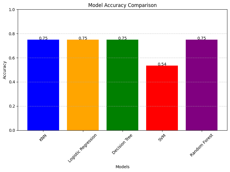
From the model comparison barchart, we observe that the KNN and RF models have produced the highest classification prediction accuracy whereas Logistic regression and decision tree had produced similar, but slightly lower prediction results. The worst model is the SVM, yielding approximately a 53% prediction. Besides from the SVM, despite so, the other 4 models can be appropriate to use as they don't yield significantly different accuracies. To get the best accuracy, KNN and RF are best.
To conclude, the KNN/RF model had the best prediction accuracy in the
classification task of whether the patient dies
import seaborn as snsimport matplotlib.pyplot as plt# Assuming cm_binary, cm_logistic, cm_dt, and cm_rf are your confusion matricesconfusion_matrices = [cm_binary, cm_logistic, cm_dt, cm_rf]titles = ['Binary Model', 'Logistic Model', 'Decision Tree', 'Random Forest']colormaps = ['plasma', 'viridis', 'Blues', 'coolwarm']fig, axs = plt.subplots(2, 2, figsize=(12, 10)) # 2 rows, 2 columns for 4 plotsaxs = axs.flatten() # Flatten the axis array for easier iterationfor i, (cm, title, cmap) in enumerate(zip(confusion_matrices, titles, colormaps)): sns.heatmap(cm, annot=True, fmt='g', cmap=cmap, xticklabels=['FALSE', 'TRUE'], yticklabels=['NEGATIVE', 'POSITIVE'], ax=axs[i]) axs[i].set_ylabel('Prediction', fontsize=10) axs[i].set_xlabel('Actual', fontsize=10) axs[i].set_title(title, fontsize=12) axs[i].tick_params(axis='both', which='major', labelsize=8) axs[i].set_aspect('equal') # Ensure equal aspect ratio for each plot# Hide any empty subplots if presentfor i in range(len(confusion_matrices), len(axs)): axs[i].axis('off')plt.tight_layout()plt.show()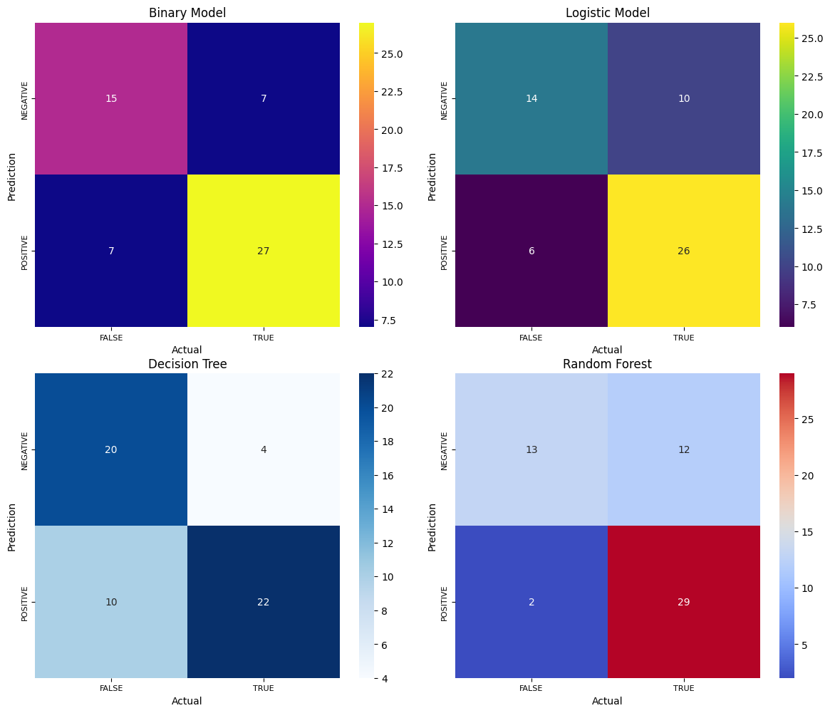
Model Stacking
Now we will try to attempt model stacking on this dataset. In simple words, model stacking is where we try to combine all outputs of our previously used ML algorithms (5 total) into one machine learning model with the hopes that It will improve prediction for our logistic model. This stacked-model, otherwise known as a "meta-learner) will attempt to minimize the weakness and maximize the strenghts of every individual model. Though, it's not guaranteed that I'll do better or worse than the 5 individual algorithms.
In that case, we can evaluate a suite of different machine learning models on the dataset so lets try the 5 algorithms
*KNN
*Logistic Regression
*Support Vector machine
*Decision Tree
*Random forest
We will also be reusing the
X_class
| N_Days | Age | Bilirubin | Cholesterol | Albumin | Copper | Alk_Phos | SGOT | Tryglicerides | Platelets | Prothrombin | Stage |
|---|---|---|---|---|---|---|---|---|---|---|---|
| 400 | 58.805479 | 14.5 | 261.0 | 2.60 | 156.0 | 1718.0 | 137.95 | 172.0 | 190.0 | 12.2 | 4.0 |
| 4500 | 56.484932 | 1.1 | 302.0 | 4.14 | 54.0 | 7394.8 | 113.52 | 88.0 | 221.0 | 10.6 | 3.0 |
| 1012 | 70.120548 | 1.4 | 176.0 | 3.48 | 210.0 | 516.0 | 96.10 | 55.0 | 151.0 | 12.0 | 4.0 |
| 1925 | 54.778082 | 1.8 | 244.0 | 2.54 | 64.0 | 6121.8 | 60.63 | 92.0 | 183.0 | 10.3 | 4.0 |
| 1504 | 38.131507 | 3.4 | 279.0 | 3.53 | 143.0 | 671.0 | 113.15 | 72.0 | 136.0 | 10.9 | 3.0 |
| ... | ... | ... | ... | ... | ... | ... | ... | ... | ... | ... | ... |
| 1153 | 61.224658 | 0.4 | 246.0 | 3.58 | 24.0 | 797.0 | 91.00 | 113.0 | 288.0 | 10.4 | 2.0 |
| 994 | 58.339726 | 0.4 | 260.0 | 2.75 | 41.0 | 1166.0 | 70.00 | 82.0 | 231.0 | 10.8 | 2.0 |
| 939 | 62.375342 | 1.7 | 434.0 | 3.35 | 39.0 | 1713.0 | 171.00 | 100.0 | 234.0 | 10.2 | 2.0 |
| 839 | 38.024658 | 2.0 | 247.0 | 3.16 | 69.0 | 1050.0 | 117.00 | 88.0 | 335.0 | 10.5 | 2.0 |
| 788 | 33.175342 | 6.4 | 576.0 | 3.79 | 186.0 | 2115.0 | 136.00 | 149.0 | 200.0 | 10.8 | 2.0 |
from sklearn.model_selection import cross_val_scorefrom sklearn.ensemble import StackingClassifierimport xgboostimport pandas as pdfrom sklearn.model_selection import KFoldfrom sklearn.model_selection import cross_val_scorefrom sklearn.svm import SVCfrom sklearn.naive_bayes import GaussianNBfrom matplotlib import pyplotfrom sklearn.ensemble import StackingClassifier#Lets use the 5 machine learning algorithms that we want to stackKNN=KNeighborsClassifier()LOGISTIC = LogisticRegression()SVM = svm.SVC(kernel='linear') # Linear KernelDTC=DecisionTreeClassifier()RF=RandomForestClassifier()#Perform Cross-valuidation and record the scoresclf=[KNN,SVM,LOGISTIC,DTC,RF]for algorithm in clf: score=cross_val_score(algorithm,X,y,cv=5,scoring="accuracy") print("The accuracy score of {} is:".format(algorithm),score.mean())The accuracy score of KNeighborsClassifier() is: 0.6093506493506494
The accuracy score of SVC(kernel='linear') is: 0.7315584415584416
The accuracy score of LogisticRegression() is: 0.735
The accuracy score of DecisionTreeClassifier() is: 0.6444155844155844
The accuracy score of RandomForestClassifier() is: 0.7317532467532467
From the results above, we noticed for some models, the accuracy improved a lot by stacking up our models compared to doing to the traditional way. However, some models performed worse than before (such as KNN). Likewise, certain models still had the best classification accuracies (Random forest) out of the 5 models for both analyses. What this tells us is that stacking could either improve an individual model, or make it worse.
Here are the results from the previous models by themselves to compare
The number on the left is the previous model, the number on the right is the new stacked model prediction. The number highlighted in bold showed an improvement in prediction after stacking. This means that for the base model (Knn, logistic, svm, etc.), the bolded number indicated that the model has improved in accuracy. Despite the improvement, some of the individuals dis-improved in accuracy after model stacking.
The prediction for the previous models MAY flucuate and vary because we are using random seed for the test train data. Also due to the stochastic nature of the algorithm, evaluation procedure, or difference in numerical precision
KNN-Accuracy: 0.75 vs 0.609
Logistic regression Accuracy: 0.7142857142857143 vs 0.735
Decision Tree Accuracy: 0.7142857142857143 vs 0.6442
SVM Accuracy: 0.5357142857142857 vs 0.7316
Random Forest Accuracy: 0.75 vs 0.7716
Box and whisker plots are created to determine the distribution of each accuracy score per model. This allows us to visually see which models performed better over others. In fact, some models to have higher spread and variability than others (that is the case with SVM)
# compare standalone models for binary classification# get a list of models to evaluatedef get_models(): models = dict() models['lr'] = LogisticRegression() models['knn'] = KNeighborsClassifier() models['dt'] = DecisionTreeClassifier() models['svm'] = SVC() models['rf'] = RandomForestClassifier() return modelsfrom numpy import meanfrom numpy import stdfrom sklearn.datasets import make_classificationfrom sklearn.model_selection import cross_val_scorefrom sklearn.model_selection import RepeatedStratifiedKFoldfrom matplotlib import pyplot# evaluate a given model using cross-validationdef evaluate_model(model, X, y): cv = RepeatedStratifiedKFold(n_splits=10, n_repeats=3, random_state=1) scores = cross_val_score(model, X, y, scoring='accuracy', cv=cv, n_jobs=-1, error_score='raise') return scores # get the models to evaluatemodels = get_models()# evaluate the models and store resultsresults, names = list(), list()for name, model in models.items(): scores = evaluate_model(model, X, y) results.append(scores) names.append(name) print('>%s %.3f (%.3f)' % (name, mean(scores), std(scores)))# plot model performance for comparisonpyplot.boxplot(results, labels=names, showmeans=True)pyplot.show()>lr 0.763 (0.078)
>knn 0.719 (0.075)
>dt 0.760 (0.086)
>svm 0.745 (0.086)
>rf 0.792 (0.087)
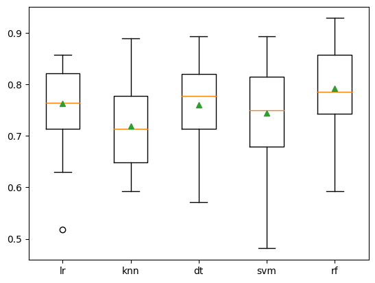
Similar to the other model above, the random forest still performed the best of the 5
Combining these 5 models into a single ensemble using stacking
#Creating a stacking ensemble of modelsdef stack_it_up(): # define the base models base = list() base.append(('lr', LogisticRegression())) base.append(('knn', KNeighborsClassifier())) base.append(('dt', DecisionTreeClassifier())) base.append(('svm', SVC())) base.append(('rf', RandomForestClassifier())) # define meta learner model stacker = LogisticRegression() # define the stacking ensemble model = StackingClassifier(estimators=base, final_estimator=stacker, cv=5) return model #Adding the stacking ensemble to the list of models we want to evaluate, in addition to the standalone modelsdef get_models(): models = dict() models['lr'] = LogisticRegression() models['knn'] = KNeighborsClassifier() models['dt'] = DecisionTreeClassifier() models['svm'] = SVC() models['rf'] = RandomForestClassifier() models['stacking'] = stack_it_up() return models# get the models to evaluatemodels = get_models()# evaluate the models and store resultsresults, names = list(), list()for name, model in models.items(): scores = evaluate_model(model, X, y) results.append(scores) names.append(name) print('>%s %.3f (%.3f)' % (name, mean(scores), std(scores)))# plot model performance for comparisonpyplot.boxplot(results, labels=names, showmeans=True)pyplot.show()>lr 0.763 (0.078)
>knn 0.719 (0.075)
>dt 0.766 (0.080)
>svm 0.745 (0.086)
>rf 0.796 (0.084)
>stacking 0.775 (0.089)

Stacking Conclusion
As we can see, running this code will report the performance of each of the 5 models as well as our stacked ensemble model. Depending on the stochastic nature of the algorithm, and since we're using random seed to generate the data, there may be some fluctuations here and there, but the concept is still the same. In our case we see that the stacking model performed better than all of the algorithms (except random forest) with an accuracy of about 78%. I think this accuracy is ok given the nature of the dataset we are using. Some models shared higher accuracy and precision than others (visually observing: that would be RF and Stacking models). The SVM performed appropriately but the precision is all over the place. I believe the SVM is not a suitable model for this data.
With or without the stacking, the 5 models shared very similar prediction accuracies with some having slightly insignificant differences in accuracy.
Non-Stacking (individual models) Conclusion
So far, we used descriptive statistics to analyze PBC data. What's different about this project is instead of using survival analysis techniques, we use supervised machine learning techniques. Those who are around stage 2 or 3 of the histolic stage of disease have a high probability of not surviving through. We have used several supervised machine learning techniques such as linear regression to determine which significant predictors is responsible for Number of Days until event (N_Days).
Likewise, we have used 5 different supervised ML algorithms which include:
- KNN
- Random Forest
- Support Vector Machine
- Decision Trees
- Logistic Regression
To determine which of the models is better at classifying whether a patient will either die or survive. They have resulted in similar prediction results; however KNN and Random Forest seemed to outperform all (of the 5) resulting in a prediction accuracy of about 75 percent. Then, we try stacking all 5 models to create a super-model for binary classification. It did improve the accuracy slightly, but not by too much