Fast Food Nutritional Information
Understand
This dataset displays the resturant and the items that they serve. For each item within the resturant, the dataset displays
- Calories
- Calories from fat
- Total Fat
- Saturated Fat
- Sodium
- Protein
- Etc.
The questions I have with this data is
- Which fast food restaurant is the best and worst in terms of health
- Which items are the either the healthiest or unhealthiest (most calories)
I plan on using classification to predict if a fast food item is deemed healthy or not (so we are using a binary 0-1 response)
Prepare
Perform EDA: Exploratory Data Analysis that would help you address some of your questions above. This includes tables, numerical summaries and graphs. Finally, split your data into a training set and a test set and remove variables that are not informative or redundant.
Use Pandas, seaborn, plotly, matplotlib and Scikit learn to implement this step
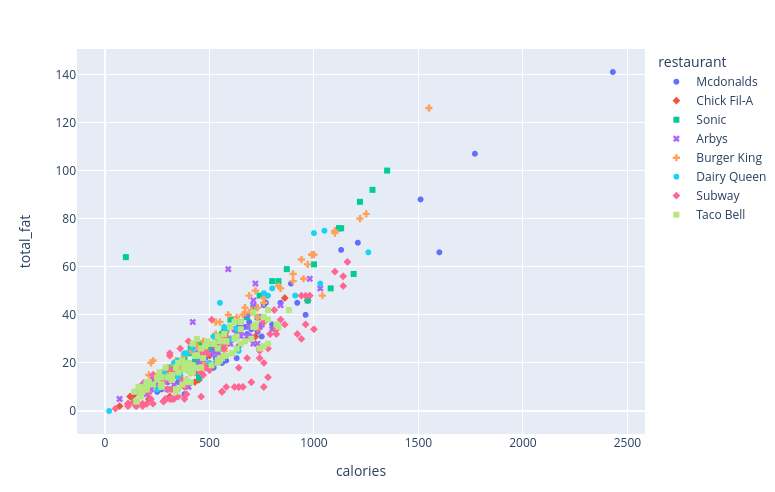
import seaborn as snsimport pandas as pdimport numpy as npimport matplotlib.pyplot as pltimport warningswarnings.filterwarnings("ignore")fastfood = pd.read_csv('/content/fast food.csv')#delete the salad column as redundantdel fastfood['salad']fastfood.head()#There are missing values coded as NA in the dataset. Therefore I will fill each missing value with the mean of the columnfastfood=fastfood.fillna(value=fastfood.mean())fastfood.tail()fastfood.describe()#Shows how many items are being served by resatruantfastfood.groupby('restaurant')['restaurant'].count()restaurantArbys 55Burger King 70Chick Fil-A 27Dairy Queen 42Mcdonalds 57Sonic 53Subway 96Taco Bell 115Name: restaurant, dtype: int64import plotly.express as pxdf = fastfoodfig = px.scatter(df, x="calories", y="total_fat", color="restaurant", symbol="restaurant")fig.show()'''groups = fastfood.groupby('restaurant')for name, group in groups: plt.plot(group.calories, group.total_fat, marker='o', linestyle='', markersize=9, label=name)plt.legend()'''
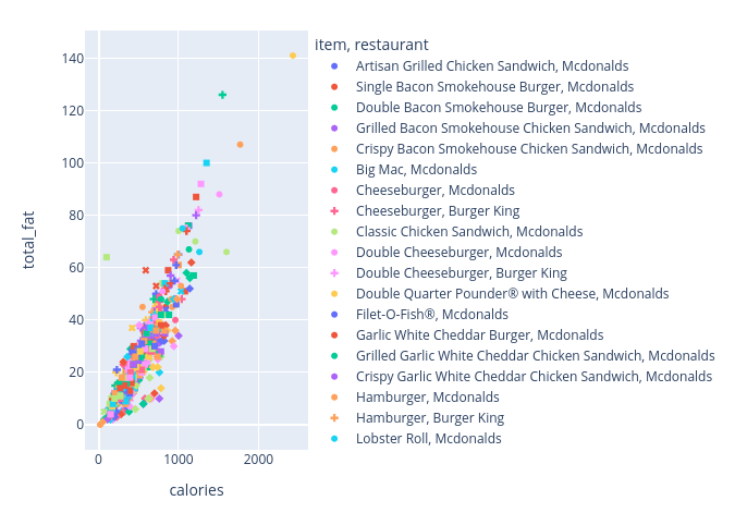
Based on the graphs shown above and below this text-box, I realized that any classification algorithm (from the understand phase) likely won't work for this type of data. Because you can see that every restuarant, and restaurant item, is so closely related and lumped together (with minimal clustering) which makes classification difficult. Therefore, since the data shows an upward increasing trend, I believe the linear regression model is the best suited on for this scenario
df2 = fastfoodfig2 = px.scatter(df2, x="calories", y="total_fat", color="item", symbol="restaurant")fig2.show()
#Delete the restaurant and item columns as they won't work when splitting the data for predictiondel fastfood['restaurant']del fastfood['item']#Split data into train and test sety=fastfood.calories #Predictor variablex=fastfood.drop('calories',axis=1)from sklearn.model_selection import train_test_split#20 percent testing data, 80% trainingx_train, x_test, y_train, y_test=train_test_split(x,y,test_size=0.2)Analyze
Identify an algorithm appropriate for your analysis. Choices include:
Regression: Linear Regression, K-Nearest Neighbors Regression, Elastic Net (Lasso/Ridge Regression), Neural Networks
Classification: Logistic Regression, K-Nearest Neighbors Classification, Random Forest, Neural Networks
Use statsmodels and Scikit learn to implement this step
#Building and training the model. We will be using linear regression as this is appropriate for predicting continous variable: caloriesfrom sklearn.linear_model import LinearRegressionmodel=LinearRegression()model.fit(x_train, y_train)pd.DataFrame(model.coef_, x.columns, columns = ['Coeff'])| --- | Coeff |
|---|---|
| Unnamed: | 0 0.000510 |
| cal_fat | 0.834085 |
| total_fat | 0.952933 |
| sat_fat | 0.604979 |
| trans_fat | 2.320083 |
| cholesterol | -0.010765 |
| sodium | 0.009695 |
| total_carb | 3.928657 |
| fiber | 0.030934 |
| sugar | 0.108872 |
| protein | 3.785856 |
| vit_a | -0.063226 |
| vit_c | 0.005903 |
| calcium | -0.037546 |
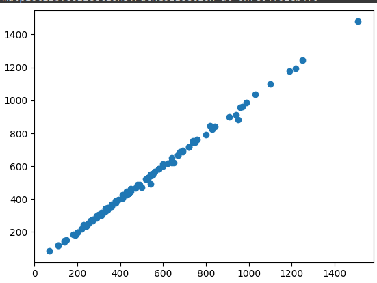
#making Predictions with the modelpredictions = model.predict(x_test)plt.scatter(y_test, predictions)
plt.hist(y_test - predictions)#Testing Model Performance using Mean absolute error, mean squared error, root mean squared errorfrom sklearn import metrics#8.60, the absolute average difference b/t predicticted and actual values and to assess effectiveness of regression modelmetrics.mean_absolute_error(y_test, predictions)#In that case, on average, the predicted values are off by about 8.6 calories from the true values, not too bad#150.48, this number is quite high but should be ok since MSE is usually highmetrics.mean_squared_error(y_test, predictions)#12.27, is the sqrt of MSE between true values and predicted values. RSME is a measure of the average#deviation of predicted values from actual values, and a lower value indicates a better fit of the regression to the datanp.sqrt(metrics.mean_squared_error(y_test, predictions))Deploy
I think the model did fine with its predictions and such. I have never done regression on Python so interpreting the outputs might be little more different than doing so on R. But from the results as well as the graph, I can say that there is a positive coorellation between Calories/total-fat (our dependent variable, and vise versa) to the other independent variables (saturated fats, sodium, vitamins, etc..)